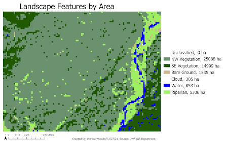
This map uses an image imported from ERDAS Imagines and it shows the different features from a snippet of the U.S. landscape and their areas in hectares.
This lab wasn't too bad. I used ERDAS Imagines in a Remote Sensing lecture and really hated the "pan" tool, but I was able to understand this tool better through this lab and now I actually think it's useful. The image quality is extremely bad, though, because of low resolution and I'm not sure how I could have fixed that or if it is actually supposed to be this bad. That is why the image in the map looks so pixelated. Another concern I had was adding items to the legend. The link provided gave us information on how to change how labels are displayed, not necessarily how to add items to the legend. Usually, I do this by adding fields to Unique Values symbology and then multiple fields show up in the legend. However, I wasn't given an option to add a field in Unique Values this time and I'm not sure why. I manually added the areas from the attribute table and positioned them to look okay. Overall, the lab was pretty informative and gave a decent background on ERDAS Imagines.


