Wednesday, April 28, 2021

LULC in Relation to the Eutrophication of Lake Tahoe


This map and graph show how the area of certain land cover classes has changed from 2006-2010 in the Lake Tahoe basin. Lake Tahoe has been experiencing concerning eutrophication, which has been attributed mostly to the urbanization and development of the area. Seeing how land cover has changed over time could be useful when interpreting the relationship between land use/land cover around the lake and the eutrophication of Lake Tahoe itself. 

This final project was a good experience overall because I got to connect a lot of the topics I've learned all semester into one cohesive project. It took a lot of critical thought and patience, but I am proud of the outcome. 


Friday, April 2, 2021

Unsupervised & Supervised Classification


This map shows a supervised classification of the land use in Germantown, MD. Class signatures were created for the features in the legend above and colored with the R4 G5 B6 color combination. A supervised classification image file was then created and recoded to exhibit only 8 classes. Area was calculated in hectares for each class and displayed in the legend. The fallow fields are the brightest of the features because they represent where I would recommend that Maryland’s "Smart, Green and Growing Initiative" expands to next if I were to present my map to the Governor. 

This lab gave me a lot more issues than I anticipated. The concepts weren't that complicated, but I just seemed to keep making little mistakes that led to a bad map. I had to restart Exercise 5 about four times and I still think it could be more accurate. I was able to tinker around a lot and figure out how to fix small issues like being able to get more accurate signatures by drawing polygons at a 1:5000 scale instead of using the "grow" tool, and how to fix the number of classes that transferred over to ArcGIS Pro from ERDAS Imagine (it brought over all 18 instead of the 8 that I recoded the image to). The bright side is that I have gotten plenty of quality practice with unsupervised and supervised classification. 


Tuesday, March 9, 2021

Spatial Enhancement, Multispectral Data, & Band Indices Lab


This is a map of the rivers on this landscape within a TM False Natural Color band combination. I looked at the histogram in metadata and noticed that the pixel spike was really tall, so the feature was going to have a relatively large surface area on the map. Also, the range where the pixels spiked was really low, which means it was going to be a dark feature. The two darkest areas were the tree-cover on the land and the rivers. I used the inquire tool to look at the exact pixel values in layer_4 for a dark spot on the tree-cover and then for a spot on the river to see if they were within 12 and 18. The spot on the river fit the prompt description, so I decided to represent that feature on this map.


This map shows the snow cover on the mountaintops of this area. I looked at the histogram and knew that the high pixel value in layers 1-4 meant that the feature should be bright in these layers and the low pixel value in layers 5 and 6 meant that the feature should be darker in these layers. I think that the snow on top of the mountainous terrain represents these criteria well. The higher the band number, the darker the snow gets (black when all layers are 5 and 6). I found this by trying the lower layer combinations and looking for bright features and then looking at those same bright features after changing the layers to a combination of 5 and 6 to see if any features got dark. I used RGB 3,5,6 to represent this feature.


This map represents the wetlands in this area of the landscape. This wetland was much brighter than the river in layers 1-4, but became the same color as the river by layer 6. I used the RGB combination 2,2,6. The brighter color in layers 1-4 means that this wetland must have higher reflectance than the river. Therefore, I assume that this wetland has water that is still or that moves at a much slower pace than what the water in the river is moving at.

Overall, this lab was pretty time-consuming for me because there were a lot of new concepts. I got through all of the exercises up to the deliverables and realized that I must not have fully comprehended any of the material like I originally thought I did because I didn't understand a lot from the deliverables exercise instructions. It took a lot of going back and experimentation to get through the deliverables section as a result. I experienced both passive and active learning in this lab. 


Saturday, February 27, 2021

ERDAS Imagine & Digital Data Lab


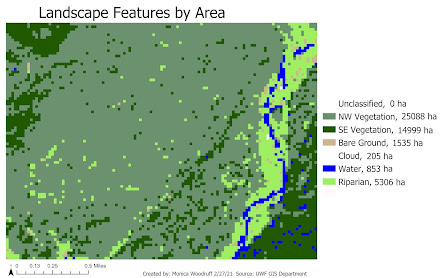
This map uses an image imported from ERDAS Imagines and it shows the different features from a snippet of the U.S. landscape and their areas in hectares. 

This lab wasn't too bad. I used ERDAS Imagines in a Remote Sensing lecture and really hated the "pan" tool, but I was able to understand this tool better through this lab and now I actually think it's useful. The image quality is extremely bad, though, because of low resolution and I'm not sure how I could have fixed that or if it is actually supposed to be this bad. That is why the image in the map looks so pixelated. Another concern I had was adding items to the legend. The link provided gave us information on how to change how labels are displayed, not necessarily how to add items to the legend. Usually, I do this by adding fields to Unique Values symbology and then multiple fields show up in the legend. However, I wasn't given an option to add a field in Unique Values this time and I'm not sure why. I manually added the areas from the attribute table and positioned them to look okay. Overall, the lab was pretty informative and gave a decent background on ERDAS Imagines. 


Tuesday, February 9, 2021

LULC Classification & Ground Truthing Lab


This map shows the area of Pascagoula, Mississippi coded into LULC land classifications. Most of this city is made up of water and residential areas. The red and green points are random ground-truthing sample points that were used to calculate the overall accuracy of the land classifications I made. The red points are areas that I misclassified and the green points are the areas I classified correctly. I had 70 percent accuracy for my classifications, which I consider to be very good for my first time doing this.

This was a very time-consuming lab, but it was not difficult. I actually learned a lot of little map-making techniques that I didn't know about before like how to incorporate multiple fields into unique values symbology and edit the labels of the symbols. I also enjoyed learning about the Create Random Points tool. I want to learn how to change the layout's background color so that it's not always a bland white, but I couldn't figure out how to do that when I was exploring all of the layout panes. One of my goals is to be able to do that by the end of this course. 

Monday, January 25, 2021

Visual Interpretation Lab


The map on the top shows the different types of textures (very fine, fine, mottled, coarse, very coarse) and tones (very light, light, medium, dark, very dark) in an aerial image from USGS. The second map on the bottom shows different land features on a USGS aerial image that were identified using association, pattern, shadow, and shape/size. 

This was a pretty good reintroduction to map-making and basic GIS skills. I've realized that I'm quite a perfectionist with maps (which makes these labs take so much longer than they need to be). A few struggles I had were finding out why neither of these maps were supposed to have North arrows or scales and why the tone shapefile from the first map didn't show a coordinate system of any kind, a datum, and units after creation. The Help forum was very helpful, though, so I learned that I would have had to manually choose a coordinate system for the tone shapefile for there to be one. This lack of projection was what caused no datum or units to appear. The unknown coordinate system is the reason why a North arrow and scale would not have been appropriate as well. There is no way to calculate direction or scale without a projection. Overall, this was an easy-going lab for which I am grateful. 

Wednesday, December 9, 2020

Final Project


Transcript:

 https://docs.google.com/document/d/1j1SeL0gp46W7ZmrhIy033FfpCedlHNswiuX5y52Qzrg/edit?usp=sharing


StoryMap:

https://arcg.is/G8LPa0


The transcript and StoryMap linked above explain an analysis I completed on the proposed transmission line for the Bobwhite-Manatee project by FPL. This analysis located any imposition of the transmission line on environmentally sensitive lands, located any imposition of the transmission line on homes in the study area, located any imposition of the transmission line on schools and daycares in the study area, and found the approximate length of the transmission line for engineering knowledge to address community, environmental, and engineering factors of the Project. Overall 7 maps were created and two other graphics. 

This final project was a very stressful and interesting experience for me. I realized how much I had just been blindly following the steps of past assignments because of this project. For a large portion of it, I felt like I actually had no idea what I was doing. Now that I'm finished though, map-making is really easy to me, and so is creating feature classes, editing attribute tables, digitizing, and using the intersect tool. I understand why the final is set up like this - it really makes you use what you know and apply everything you've done before. I learned a lot from this, but I also spent an insane amount of time on it, so I'm glad it's over. 


LULC in Relation to the Eutrophication of Lake Tahoe

  This map and graph show how the area of certain land cover classes has changed from 2006-2010 in the Lake Tahoe basin. Lake Tahoe has been...